
Overview
Bitly is primarily a free URL link shortener, QR Code generator, and has recently launched a Link-In-Bio tool. Based on what type of account a user has, he/she will have access to various types of data regarding their links such as number of clicks, when they are being clicked, what platform they came from, which country, etc. I was a Product Design Intern on Bitly’s User Experience team (The Ocelots) focused on making link data more insightful and actionable for users.
As I made my way through the human-centered design process, I had weekly syncs with Bitly’s product team, design team, and a full-time senior product designer who acted as my mentor (Danielle Gardner). She critiqued my planning, work, and designs and helped guide the direction of my project. Alongside this, I helped build components for Bitly’s design system in Figma. I observed meetings with engineers to gauge how products were being developed, and also attended sprint/quarterly planning with the entire company.
What's the problem?
Bitly's Product Vision
Make every piece of information shared with the online world connect and ignite action.
How can we make link data more actionable and insightful for users? Several user interviews have brought up this issue:
“If I knew what time of day my links were clicked the most, I would share them at that time.”
“It [Bitly’s data] doesn’t give me any information I want to know about a user’s journey - just stuff I already know.”
“I want more useful analytics, but I don’t what analytics would bring me insights I need.”
The ultimate need of a typical Bitly user is insightful link data that drives them to improve their marketing strategy, outreach, and any other processes they go through with sharing their links. Numbers and graphs can overwhelm people! What’s the point of data if it’s not useful?
It's all about the users!
User Research Goal
How can we make dashboard/link data more actionable for users? What data drives engagement and behavior/action?
After spending time perfecting my user research protocol, I interviewed 10 users over the course of 2 weeks to learn the most about how they utilize our link data and how we can improve. Ranging from various backgrounds, all used Bitly in different ways, but had several similar struggles and needs.

Caren
Business Owner
Use Case: Uses amount of clicks to determine success
Action: Alters verbiage, how/where she posts based on these metrics
Wants to see the time of day her links received most clicks/

Claira
Marketing Strategist
Use Case: To formulate optimal marketing strategies
Action: High amount of clicks & location she intended
Wants more specific demographic data

Michael
Author
Use Case: Doesn’t know how to use the data
Emotion: Is angry about how social media restricts his freedom to advertise books
Wants advice on how to increase traffic with his links, so he can get more data

Aneesh
Entrepreneur
Use Case: To see where things need to change & where to focus in sharing
Emotion: Data make him feel good and that he is making progress
Wants to know are morning/afternoon links better, who the people are/why are they clicking

Virginia
Communications Coordinator
Use Case: To see if audience is interested/engaging with content
Action: Support marketing efforts that are working/not working
Wants to know how long clickers are staying on page & which sharing platforms bring most engagement

Jeff
Educator
NO Use Case: Doesn’t provide valuable data and doesn’t affect his behavior
Action: None - doesn’t care who clicks on his links, he knows his audience
Wants better data that will give him good insights

Delon
Graphic Designer
NO Use Case: Doesn’t look at data because he doesn’t want to worry about numbers
Action: Only cares about sharing, not the attraction it gets - knows his audience
Wants to see more locational data and know when to stop sharing links if they don’t get much clicks

Cinthia
Content Creator
Use Case: To see how to share her content with her links
Action: Helps her make decisions with sharing
Wants to know how to share/what to include in posts, which link at which time/day shared in which platform gave her the most clicks

Shelby
Social Media Marketer
NO Use Case: Always on a time crunch - has no time to gather good insights
Action: None - no time to stray away from routine
Wants an email/pop up with analytic summary of what links did well, what platforms are the best, the best time of day to share, etc
Several of the users expressed similar struggles and needs. However, there were 3 outlier users - Jeff, Delon, and Shelby - who all don’t currently use data for certain reasons. Looking at the majority who do look at link data, I extracted common themes & useful insights I saw amongst each user:
Themes
- For users that care about their data, their primary goal is to maximize engagement with their short links. This changes their behavior for future links (whether it’s the naming of the link, where they are sharing, when they are sharing, etc)
- There are a lot of factors than can contribute to engagement (some we know, some we don’t know), but we can narrow down and start with factors we do know i.e time of day, which platform, etc.
- How can we help users maximize clicks or engagement with their links?
Ideation
How might we help users maximize engagement with their links?
Through my ideation process, I kept in mind all of the things the users told me. I extracted the underlying need from both suggested solutions and users' surface level thoughts.
I brainstormed for a few hours and wrote down every possible idea that came to my head & grouped them by topics:
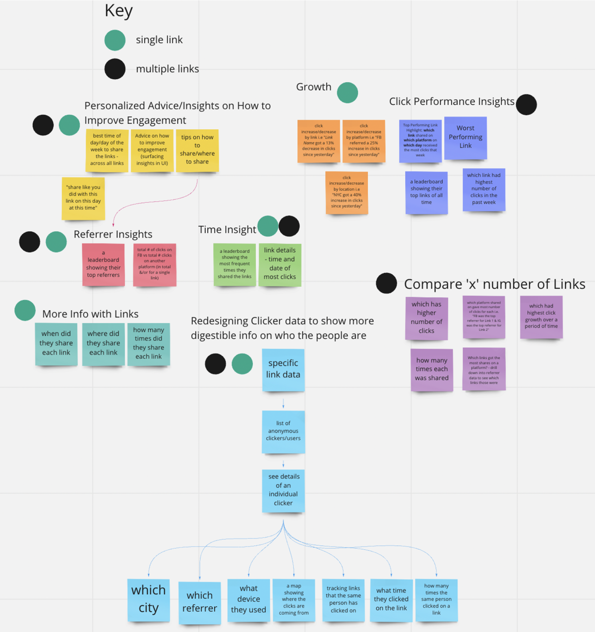
I met with a Bitly Product Designer and Project Manager to create a MVP matrix.
Focusing on the value y-axis first, we picked a solution, placed it where we thought was best, and then the next solution had to be either lower value or higher value than the previous solution. We continued this process with only the ideas that stood out most to us.
MVP Ideation Matrix
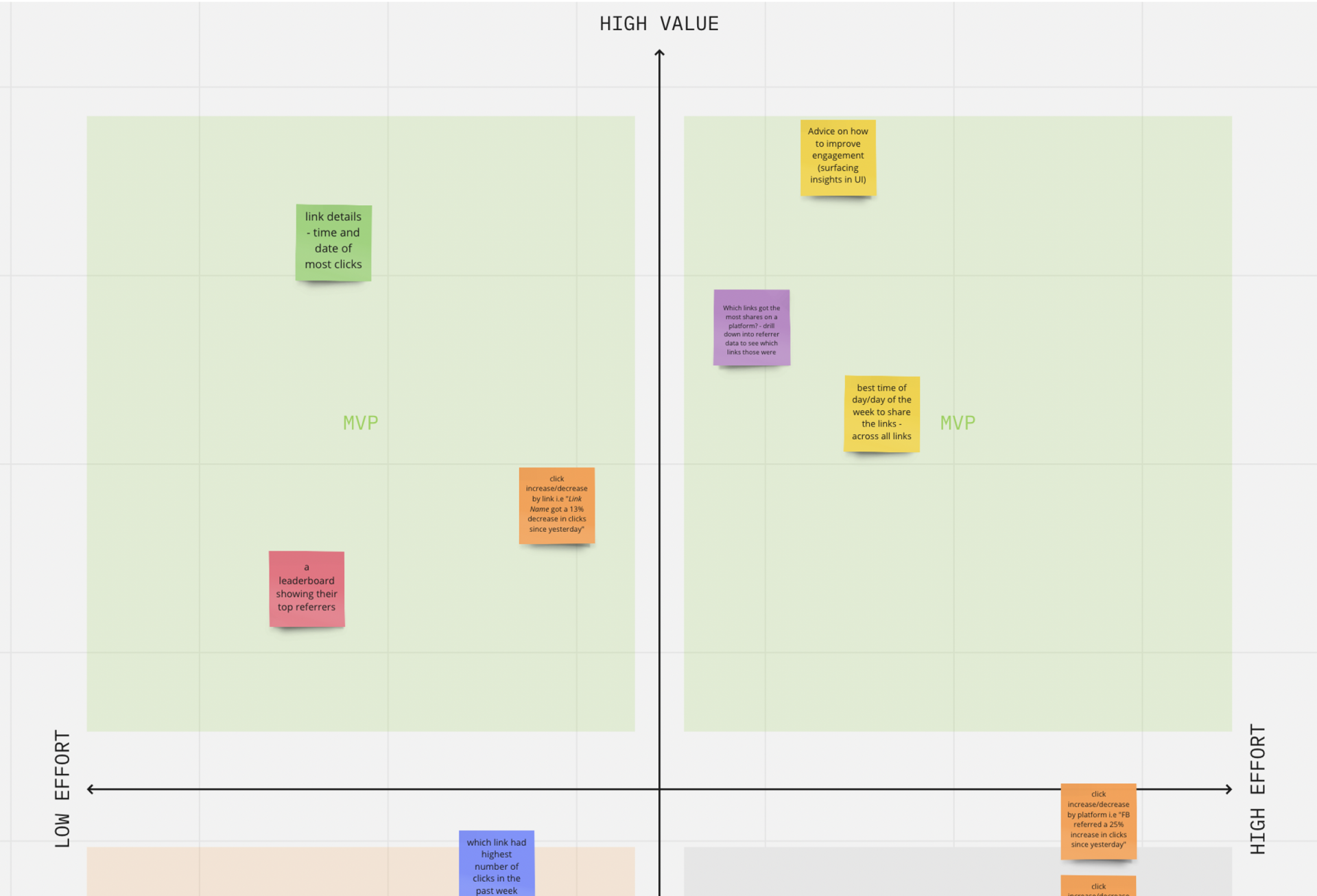
The solution I chose to move forward with was... *drumroll*
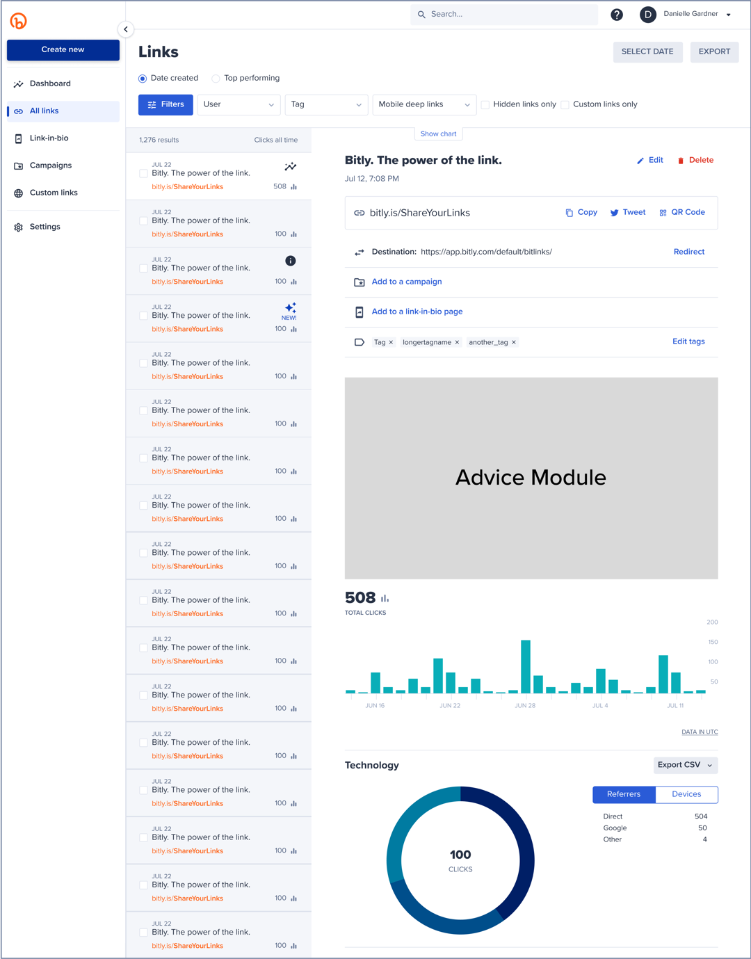
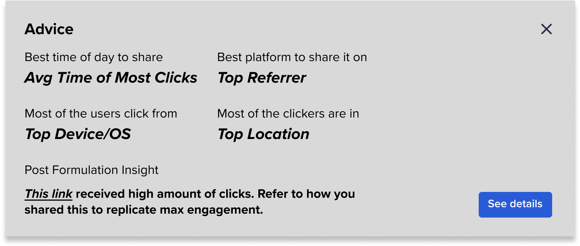
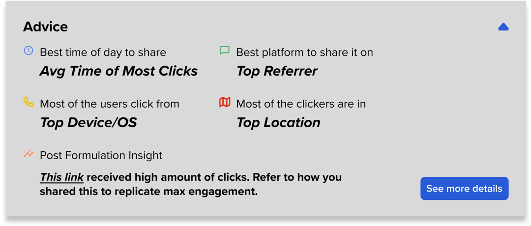
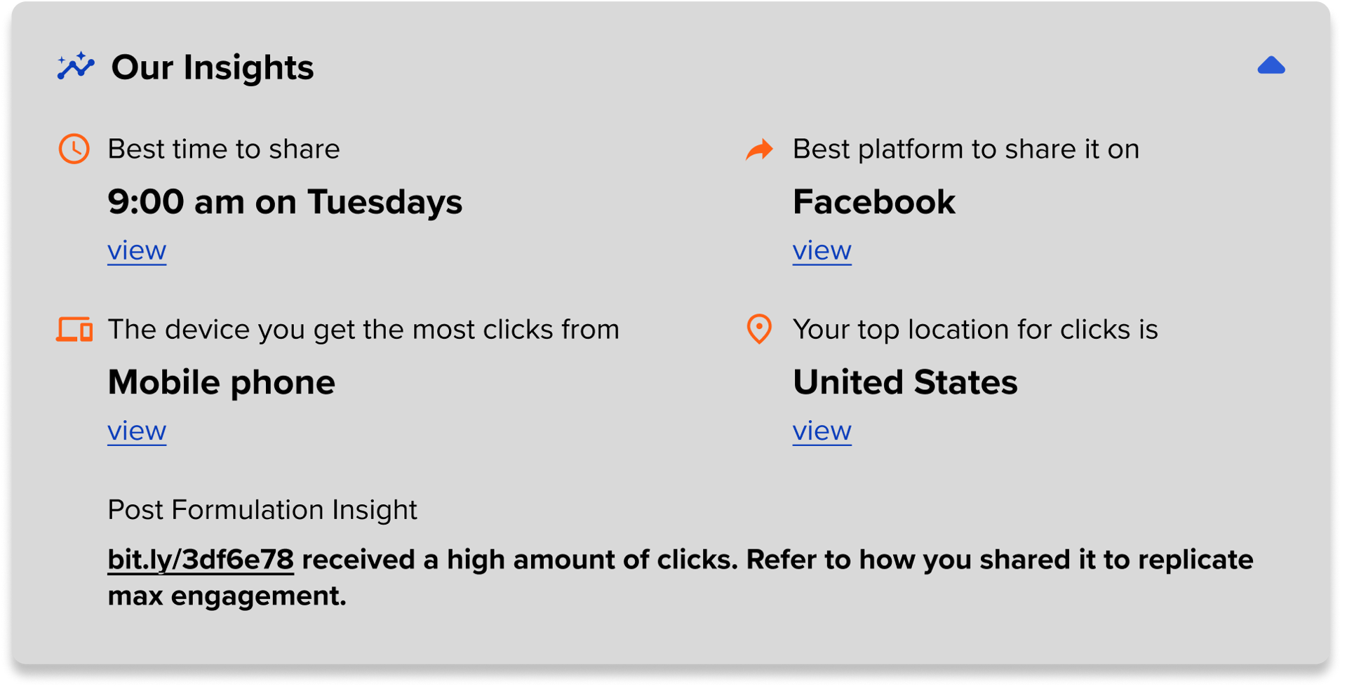
Advice on how to improve engagement by surfacing link data insights
While it is on the higher effort side, this solution has the highest value and it encompasses a lot of my other ideas. My vision for the solution was essentially a small module at the top of each link data page that includes...
- the best time of day to share
- best platform to share the link on
- top location
- top device
- the best wording of a post to share by highlighting the overall top link
- being able to manually track when & where you post each link to match peak engagement data with a specific link share
Most parts of my idea were feasible but as I began iterations, my PM pointed out that the last content requirement was going to be hard to implement, so I tossed it.
Overall, my solution surfaces insights that we already show users through the existing data, but in a more digestible way.
Iterate, iterate, iterate!
My favorite part of the design process... design iterations!
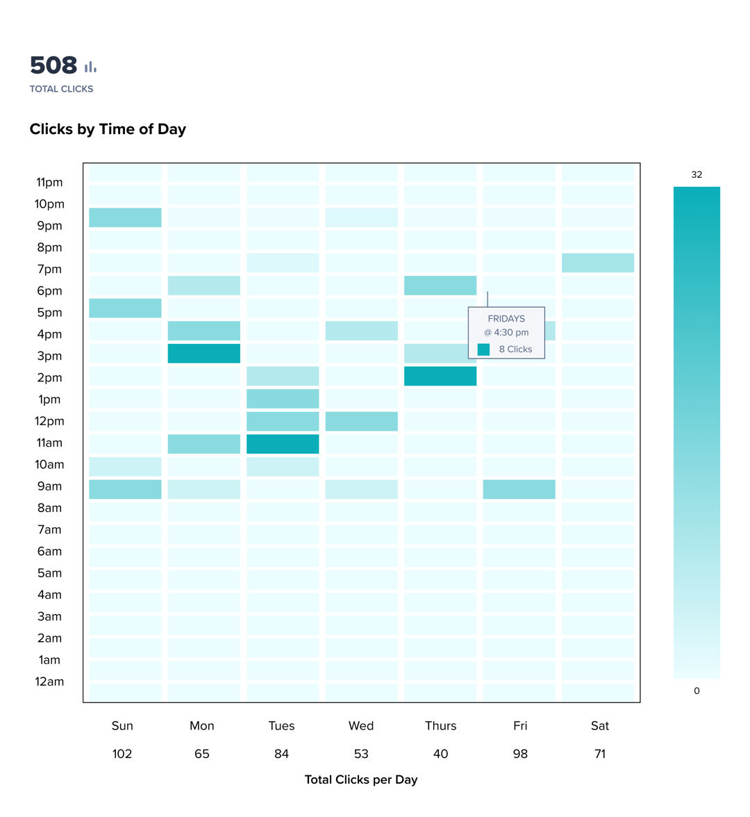
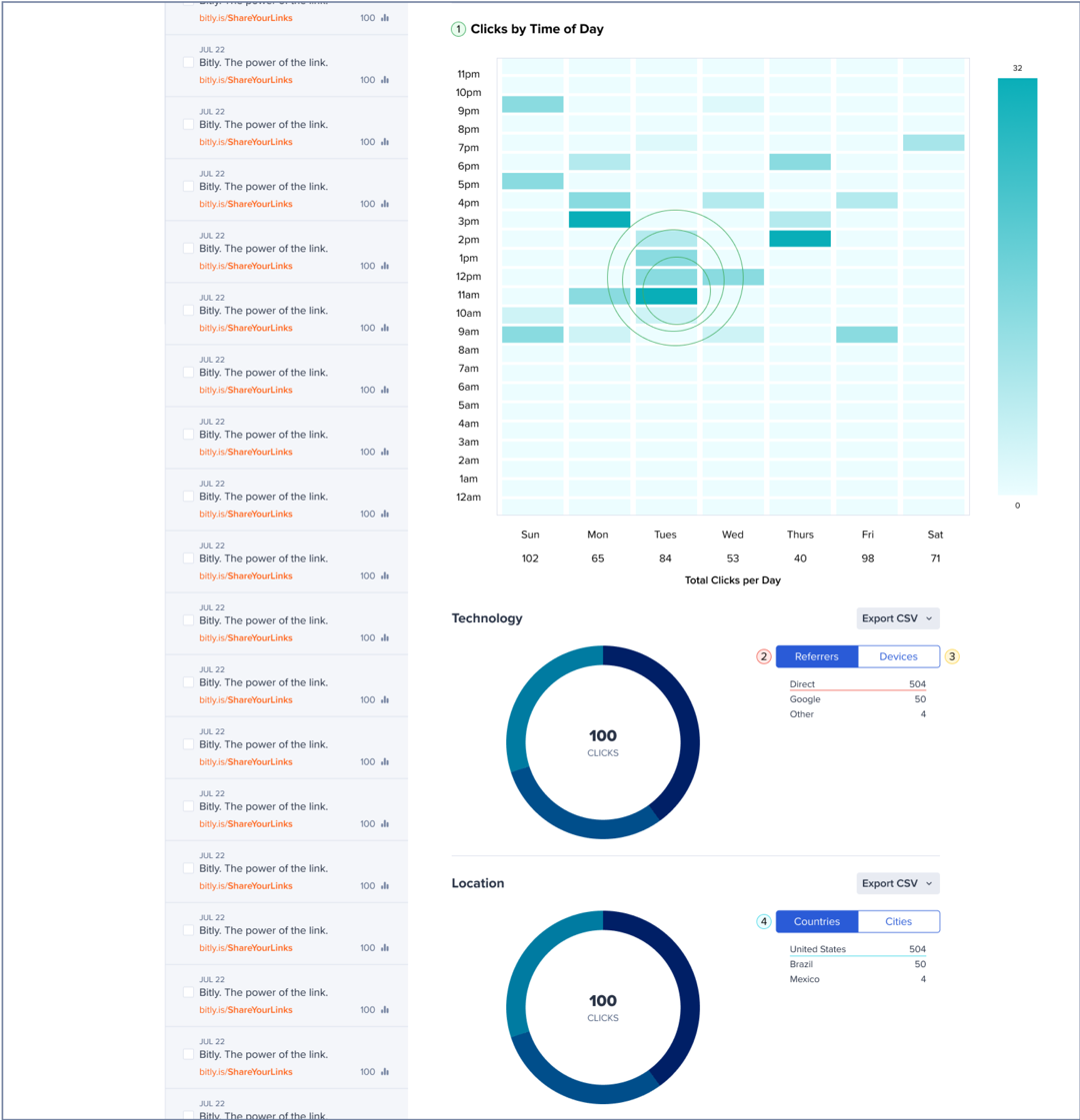
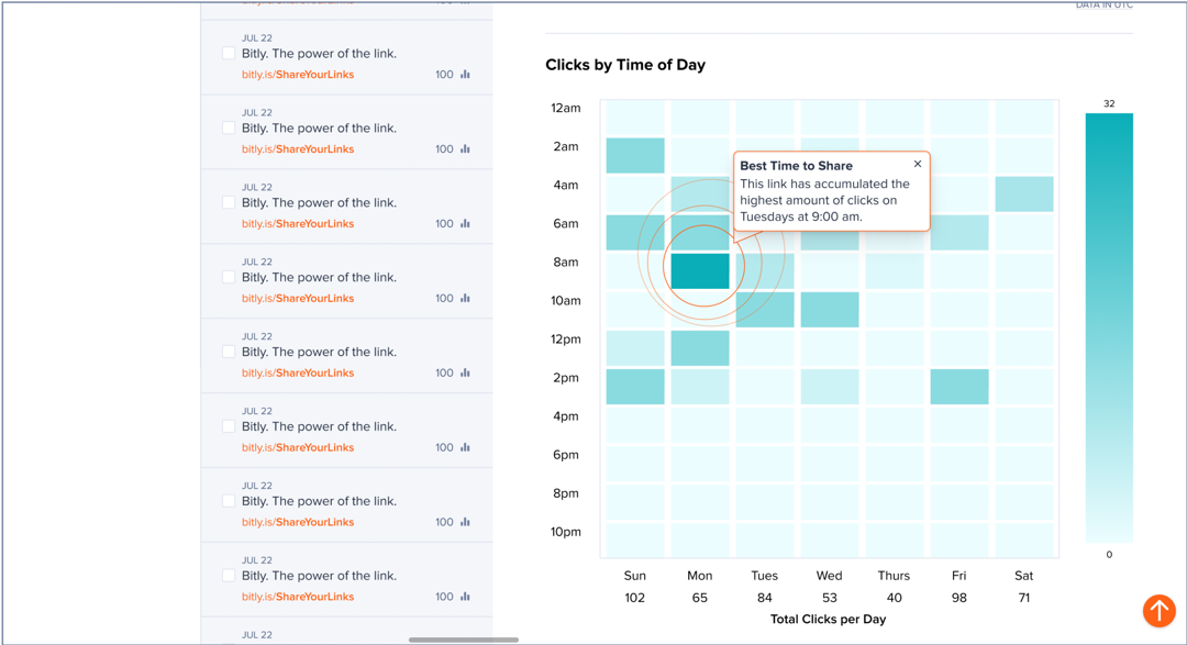
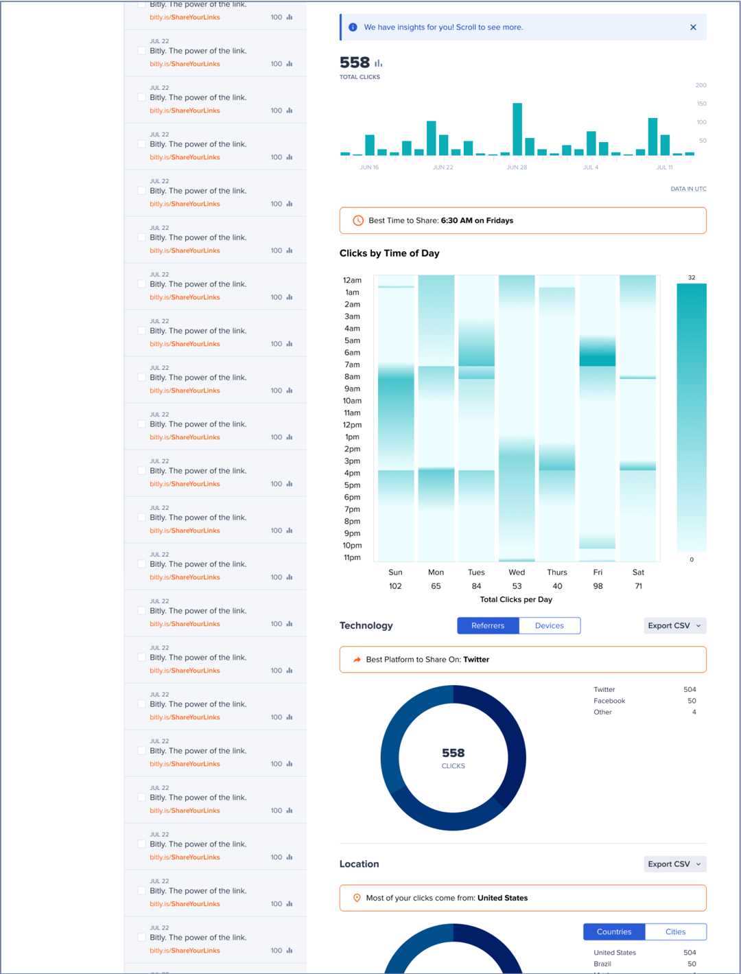
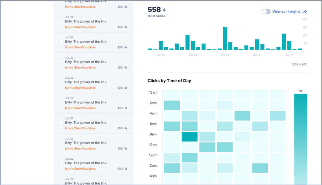
Before iterating on how to display the advice in the UI, I designed a new data representation for clicks by time of day.
Before
Clicking bars to see hourly breakdown is unintuitive!
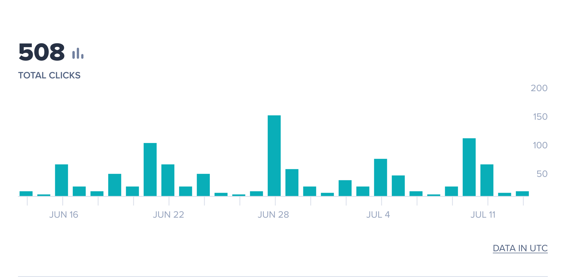
After
Gradient Heat Map vs Segmented Heat Map
V1
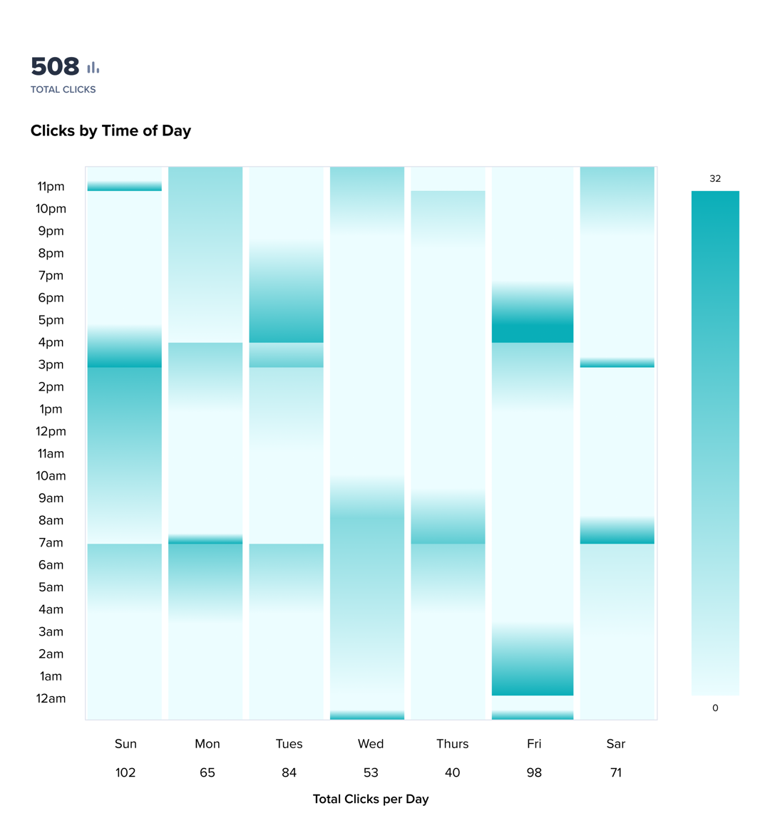
V2
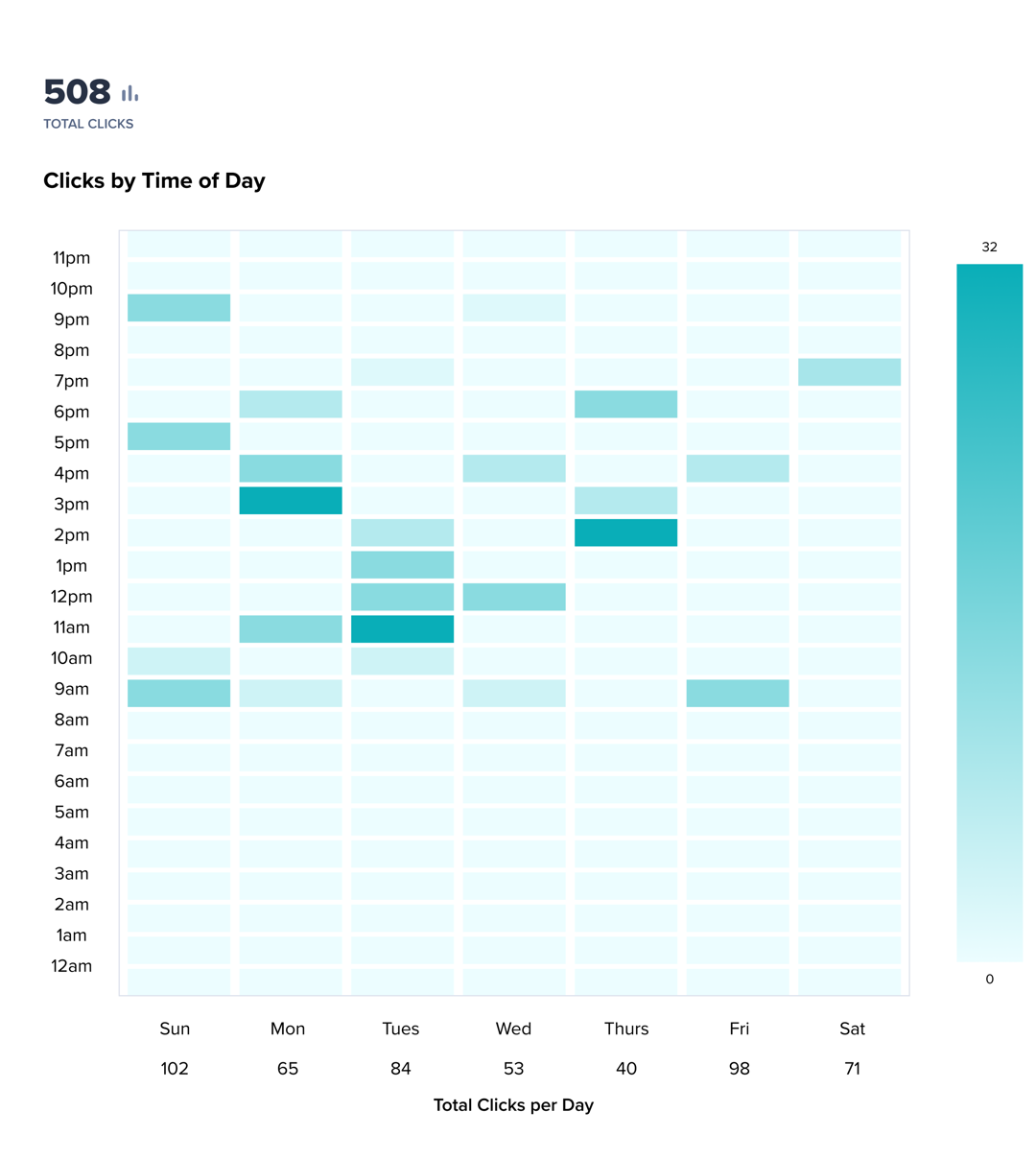
V3
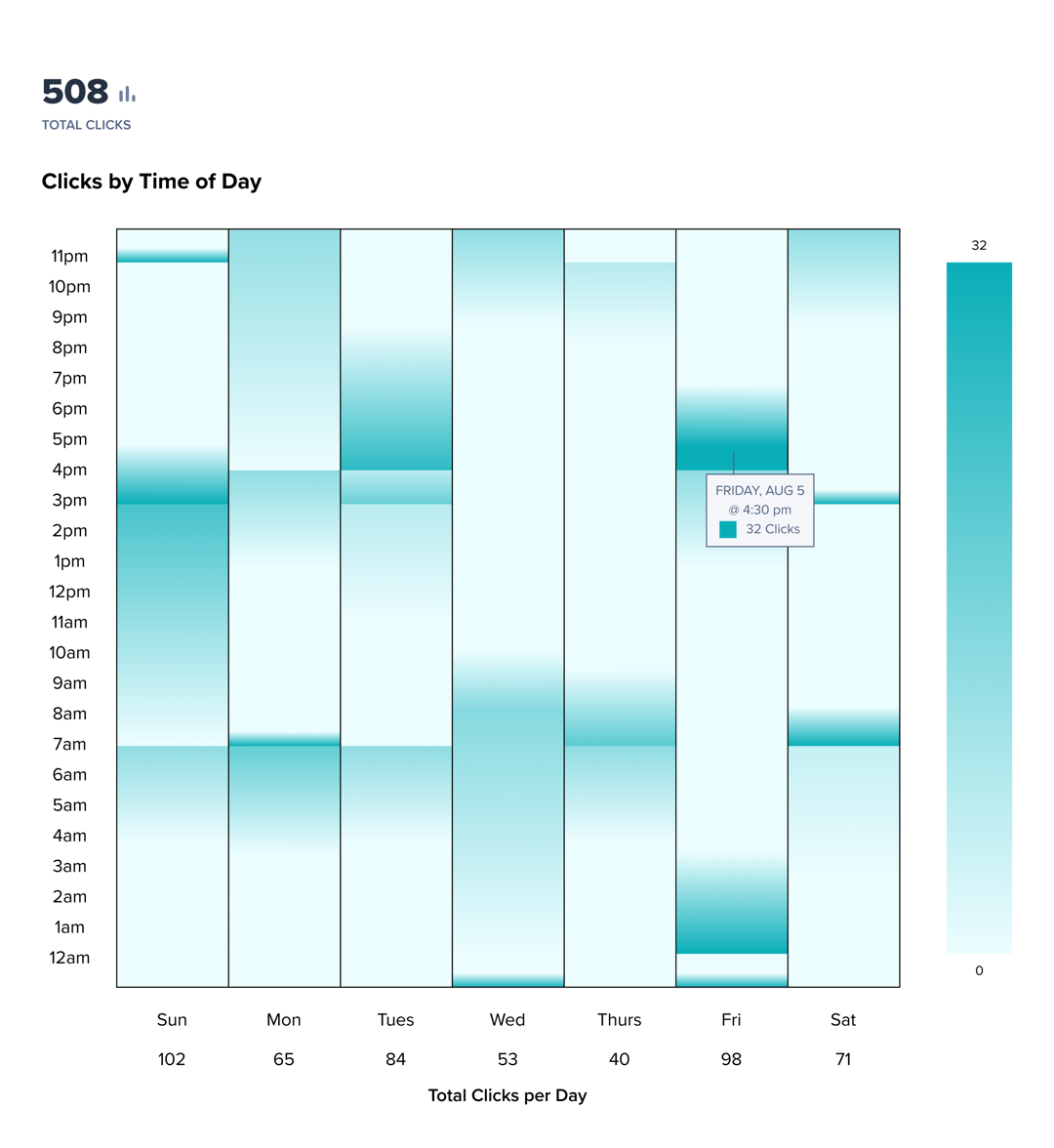
V4
Now onto the iterations of my main advice feature...
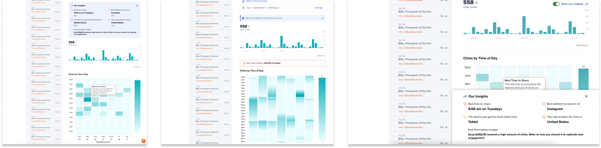
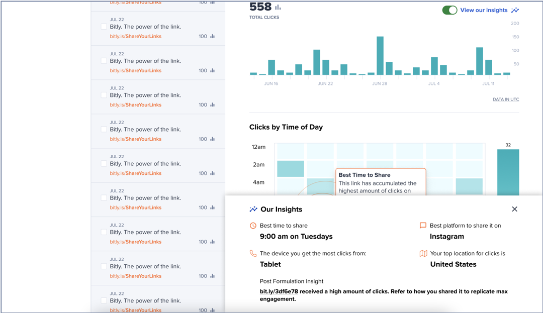
Iteration 1: "Advice Module"
In this iteration, I decided to place the feature below link editing and above link data since this feature essentially summarizes the data below it.
I had 4 visions for what this "advice module" could look like.
V1 Column Layout with Close Button
V2 Section Layout with Close Button
V3 Toast Styled Drop Down Menu
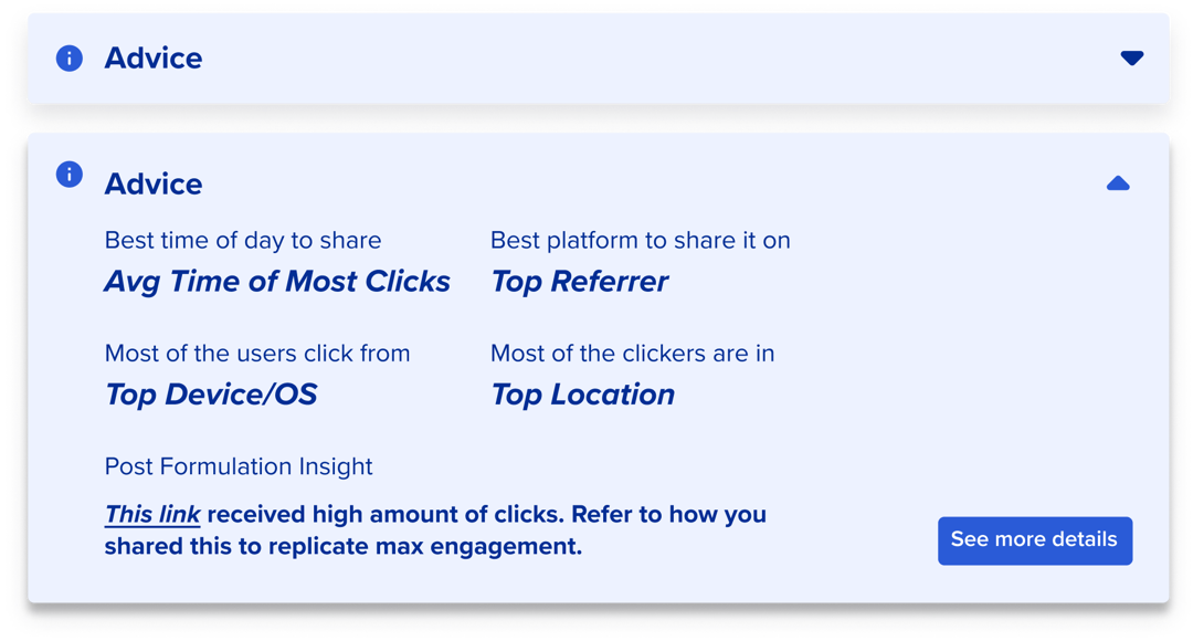
V4 Drop Down Menu with Separated 5th Insight
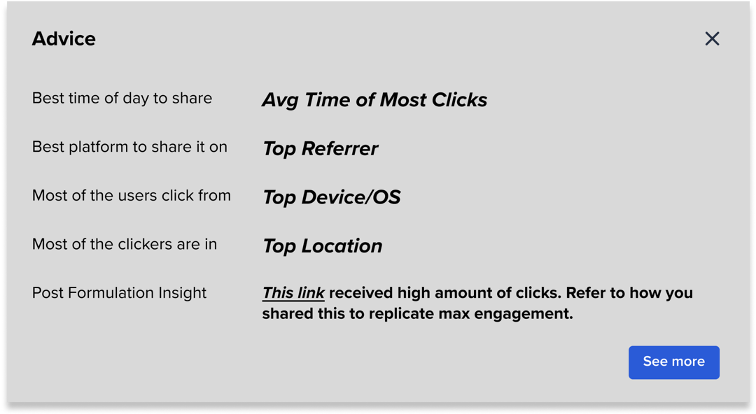
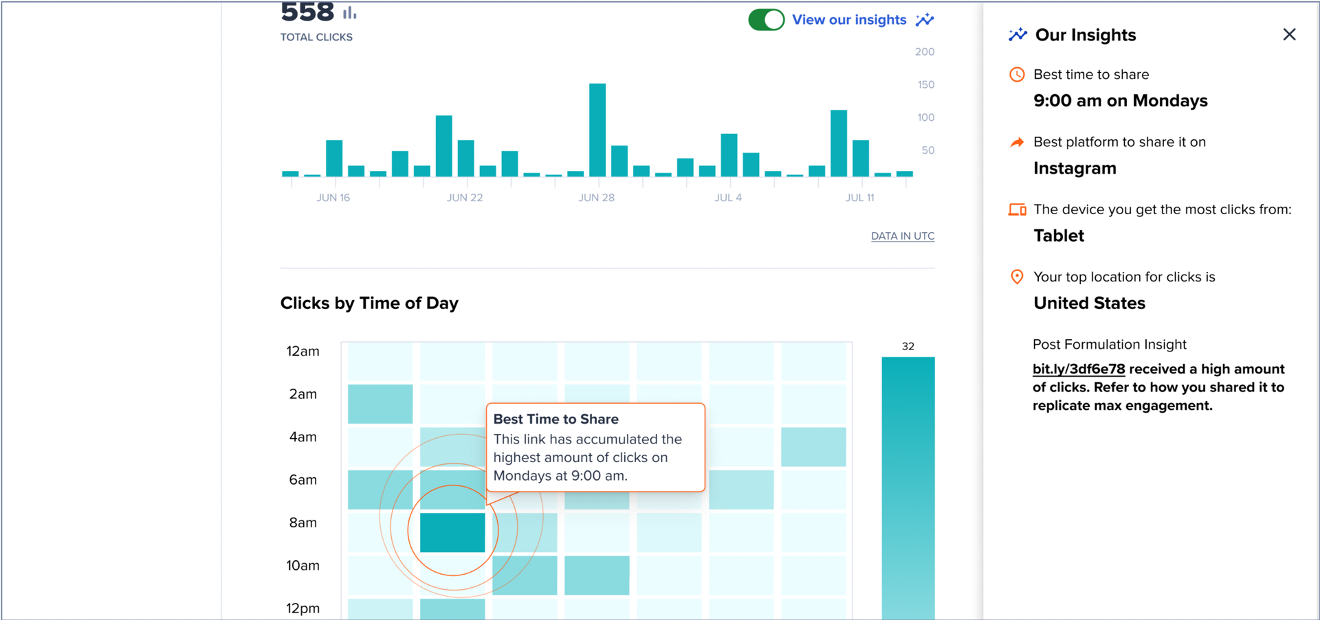
Iteration 1: "Advice Module" > See Details
For my vision of what the ‘see details’ button would do, I altered the "advice modules" and marked each insight like a key. The corresponding data visual in the link data will have the same icon that its insight has.
V1 Icons
Altered "Advice Module"
V1 Numbers
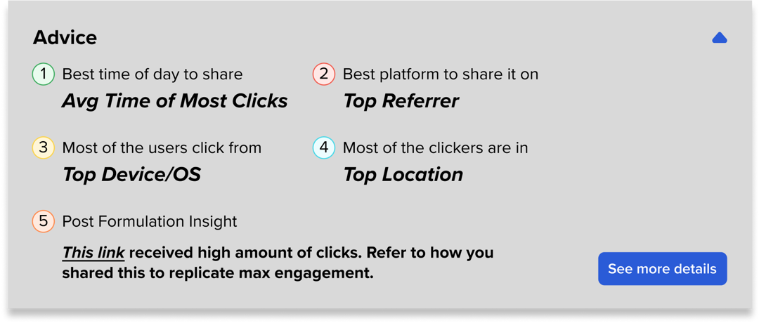
V2 Symbols
I also explored ‘view’ hyperlinks in the "advice module" that autoscrolls the user to an explanatory blurb about the corresponding data visual.
V2 Explanatory Blurbs & Arrow to Autoscroll Back Up
V3 Icons & View Hyperlinks that Autoscroll to Data
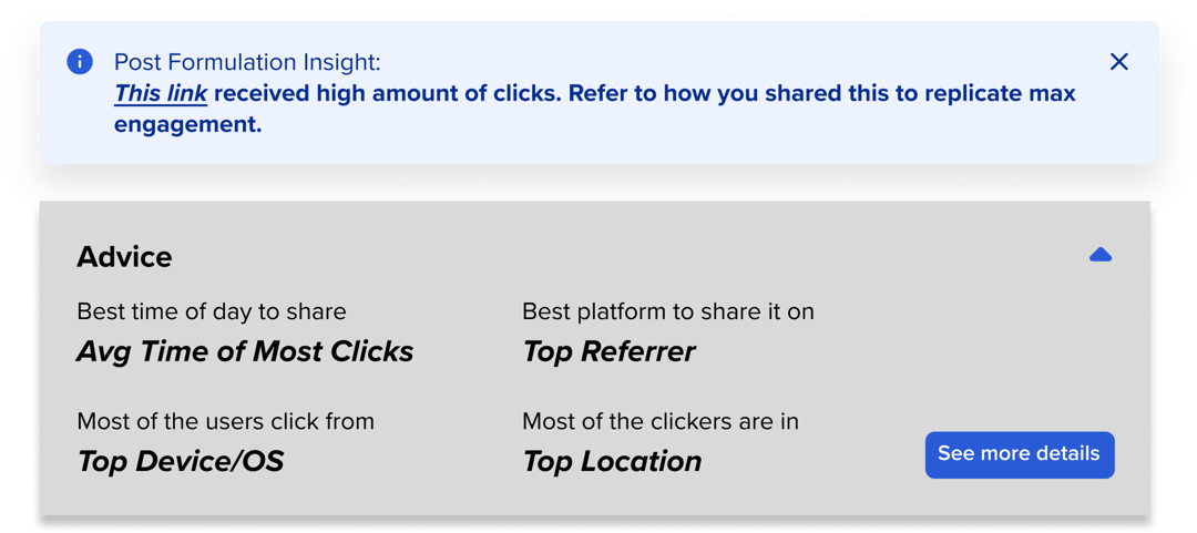
Iteration 2: Dispersed Insights
My second vision for the feature was to blend it within the UI using existing design elements. There is a "toast" (notification style banner) at the top of the page that draws the user's attention to the insights. Then, as the user scrolls, they can see insights as highlights through the data.
Iteration 3: Advice Toggle Button
To allow the user more control over the feature, I explored another way to display the insights as an adjustable setting. I implemented a toggle button that displays the "advice module" at bottom of the screen.
User Testing
Prototypes
I created 3 Figma prototypes for each iteration and conducted 6 usability tests on different users.
Prototype 1: Advice Module with View Hyperlinks & Segmented Heat Map
Prototype 2: Dispersed Insights & Gradient Heat Map
Prototype 3: Toggle Button with Bottom Advice Module
Common Themes in User Feedback
Users liked Prototype 1 the best
- Intuitive, easy to navigate
Users prefer the segmented heat map.
- Less overwhelming, easier to read
Users want the cross referencing of insights.
- Makes the data more actionable
Users did not use/see the orange arrow in P1.
- Needs to be a floating a button instead of just appearing when the user is autoscrolled down.
Users did not know what the ‘post formulation insight’ meant, but once I explained, they thought it would be very useful.
- Needs to be renamed to ‘Your Top Performing Link’
Where to go from here?
My internship ended before I could improve upon my designs based on user feedback. But I had several thoughts on how Bitly’s Product team can use the results to iterate on my solution. I compiled my thoughts, and presented them to the head product designer and product manager of Bitly’s User Experience team on my last day.
My Thoughts
Improve P1:
- Make the orange arrow a floating button.
- Explore the cross referencing of the insights: "In the mornings, more clicks come from [Top Platform], but in the afternoons, more clicks come from [Second Platform].
- Rename Post Formulation Insight
- Explore different visual designs
P3 has potential
- The main reason why my users really hated this flow is because the slide up panel blocked a lot of important information. And the toggle button had poor visibility.
- What if we explored a panel that slides over from the side? The link list and/or the nav bar on the left of the data can be collapsed and the advice panel can slide over from the right.
Iterate on better Heat Map design
- Highlighting multiple time chunks?
Starting off minimal is probably best but...
- Reword blurbs to provide more clarity on why it’s useful
- E.G. Instagram has been a melting pot of clicks for this link! It’s a good idea to continue to share here, but we’ll let you know if it changes
Add quick feedback in the UI: do the insights work? User can choose yes/no and leave optional details.
A Little Reflection
I absolutely loved my time at Bitly. I learned so much about the design process, how to interact with users, how to work with real PMs on a real Product Team, on a real product used by millions of users. This was my first internship at a relatively big & well-known tech company, and I couldn’t be more thankful for this experience. If I had more time, I would improve on my design from my user testing insights, any other ideas I had, and do more thorough user testing. My favorite part of the internship was definitely the people. They were all so extremely supportive and treated me like a real employee always appreciating my perspectives and ideas. My biggest challenge was definitely understanding the depths of Bitly’s product and what is feasible and not feasible for the engineers to implement. I’m proud to share that my data insights solution is confirmed to be put on Bitly’s Product Roadmap and will be implemented in the interface by the beginning of 2024.

Thanks for stopping by! See you again soon.